Showing posts with label spray. Show all posts

Sunday, February 8, 2015

Documented Life Project Week 5

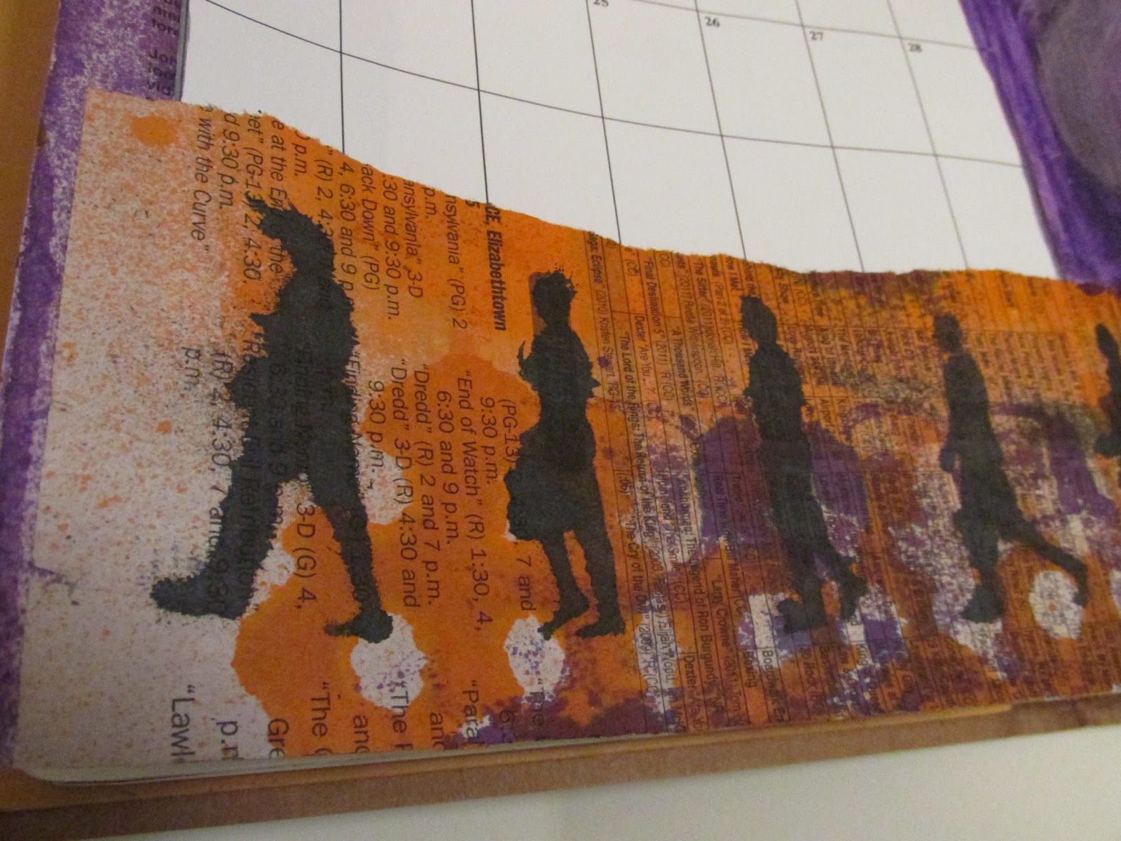
This journal spread has kind of a sloppy look to it, but I was a little worried about getting too far behind in the weekly assignments for Documented Life Project 2015.  The Art Challenge for week 5 was "under paper".  That's the scrap paper we use to put under whatever we are working on, the paper where you clean your brushes, use up your paint, etc.

I have been trying to de-clutter and de-stash lately, so I didn't have much under paper on hand.  But I did have these scrap papers which were stored with other "good" stenciled papers using the same spray colors.  These are the result of spraying and stenciling, with stencils blotted on newspaper and old ledger paper.  Like I said, pretty sloppy. 


I decided not to even think much, just put it on the page.  I did prep the pages with gesso, but in retrospect, that probably wasn't needed.  I ran all these papers through a Xyron machine to put a quick adhesive on the backs, and lickety-split, all the papers were down on the page. The only thing I would change is the February calendar.  I meant to print it on old paper that is less stark white, but forgot.  So, I'll tone it down each time I add something to the calendar, and maybe it won't glare at me so much when I look at it.

I'm still adding things but I did find something interesting that happened as I worked.  After attaching the under papers, there was a big white square in the middle.  I painted some purple there and blotted some off while it was wet.  When that dried, I used a black Stabilo pencil to make circles.  I used a wet brush on the back circle then blotted it off.  It seemed to take some of the purple off too, and I really liked how it looked.

Feels good to use up those papers in this way!

Sunday, September 8, 2013

Random Play

Sometime a girl's just gotta play.  No plan, no goal, no instructions. Below is just that. 

The only thing I had in mind was to try using paint as a resist.  I saw Tim Holz demo his distress paint used as a resist.  I bought only one color of the distress paint, Antique Linen, because he said it's the closest to the color of a manilla tag.  So, that's how most of these started out, using linen colored paint dabbed through a stencil, on a couple of cheap file folders.

This one does show how the paint acts as a resist.  It also shows where the paint blobbed in the middle of the design.  The metallic spray in the top left corner is much prettier in person by the way.
This is another file folder where I tested my sprays before spraying the other folder.  I also blotted my wet stencil here.  Later, I cut out three hearts from window screen repair tape.  They are naturally sticky, so I can move them around to see if I want to use them.
 
 This is another file folder where I blotted my stencils after spraying on the one in the next photo.
 My cheap file folders were a little too cheap - they warped and curled from the wetness.  I switched to glossy photo paper, just to see what it would look like.  I tried to tone down the color some with spritzes of water, but the ink had already dried and nothing happened.
 This is also photo paper, a piece I had blotted stencils on .  I really wanted a runny look, and since the water wasn't working, I tried bleach (I didn't have straight bleach, and used a bathroom cleaner that contains bleach. NOTE:  As always, if you are using bleach, use in a well-ventilated area.)
I sprayed bleach, then water, and it did begin to run a little.  I had forgotten I also had some paint on this before I sprayed on it.  When I started to blot off the excess water, it pulled some of the color and paint off.  Some of the paint that remains has a kind of crackle look.

I'm sure these will end up as "parts" in a collage some day.  And I'm sure I'll play more with the photo paper in the future.  It reacts so differently, there are discoveries just waiting to happen!

Sunday, August 25, 2013

Boxed Words

I love to browse other people's blogs and become inspired.  Sometimes, I can't wait to try out an idea or technique.  This time it was Julie Fei-Fan Balzer's blog that inspired me.  She shows how to make sprayed and boxed letters Here.  I like it when I have things on hand to jump right in and try it.

I used a smaller size journal and some letter stickers for my word "fun". I thought the stickers would be good to use because I've had them a long time and they are not very sticky anymore.  Therefore, it would be easy to spray the word, then pull up the letters to spray the word over and over. 
Of course, you know what they say about the best laid plans.  That little pile of colored pieces to the right of the journal are what's left of the stickers.  Since they were paper, the spray really got them wet. When I tried to pull them up, they just tore to bits.  Fortunately, each letter has multiples, so I was able to spell the word three times without running out of letters.  Live and learn.
But, my word "fun" seemed pretty big for such a small page.  I scrounged around and found some smaller press-on letters.  I liked the size of "play" much better.  Plus these letters are more durable yet pulled off the page easily to be repositioned four times.

I used Dylusions sprays for the boxed letters.  I used watercolor pencil (blue and yellow) to color the backgrounds, then brushed that with a water brush.  On the play page, I used pan pastel with a stencil to add a little more to the background.
Incidentally, the borders on both pages were done first.  I used stencils and traced the border designs in pencil, then filled it in with permanent black marker while sitting in front of the TV one night.  That was about a week ago, so when I decided to try the boxed words, I went straight to those pages.
It was fun, fun, fun!

Saturday, May 25, 2013

A Sucker for Sprays

I know I talk a lot about sprays and stencils.  I was fairly certain I now have plenty of each and even if I ran across new stencils and new sprays, I could happily walk away and use what I already have.  Then one day at Michael's (the only craft store in my area), I saw some new sprays.  Apparently there is a whole line of Heidi Swapp scrapbooking materials I didn't know about.

The colors were luscious, but I didn't buy any.  However, I did think about the sprays from time to time.  I finally took my 40% off coupon to Michael's one day, just to buy one bottle to try out.  Somewhere along the way, I had also learned the sprays have more of a metallic sheen to them.  I don't normally go for the glittery shiny look.

Long story short, when I got to Michael's, they had added a bunch of stencils too, and I ended up getting a big 12 x 12 design, plus one bottle of what I thought was gold spray (turns out it is Mustard, but looks like gold sprayed on black).
 I sprayed a very light mist back and forth a couple of times onto black cardstock.  It's important to remember when spraying that less is more.  I took another piece of black cardstock and blotted the wet stencil to get the reverse image.
These are not great pictures, but you get the idea.  It's a very nice gold-ish color.  I would not be surprised if another coupon leads me to try another color in the future....

Monday, September 10, 2012

Verbs

Spray.... Stand... Drip... Dry... Admire....


I have multiple projects going most of the time.  This is something I played with last month - still trying out spray inks!  I saw some Dylusion inks on sale and bought a couple colors, then bought a few more bottles at Stampaway when I ran across them.  They are such vibrant colors and they spray really well.  I think these are my new favorite spray inks.  (No affiliation, yada yada yada...)

The first and last pictures are done with black and blue inks.  The middle two are brown and blue.  I sprayed heavy layers and stood the journal up to let it drip.  Now these pages are just waiting for the next step (whatever that may turn out to be!)

These inks are from Dyan Reaveley, and I used her techniques.  This last one, I used a paint brush dipped in water to draw leaves - the water removes the ink from the page, leaving that part whiter.  I experimented using black and then white to outline the leaves and make vines.  Not sure which I like the most.  These pictures are really dark, but the pages in person are very bright and vibrant.  

 
To see Dyan's video, go here.